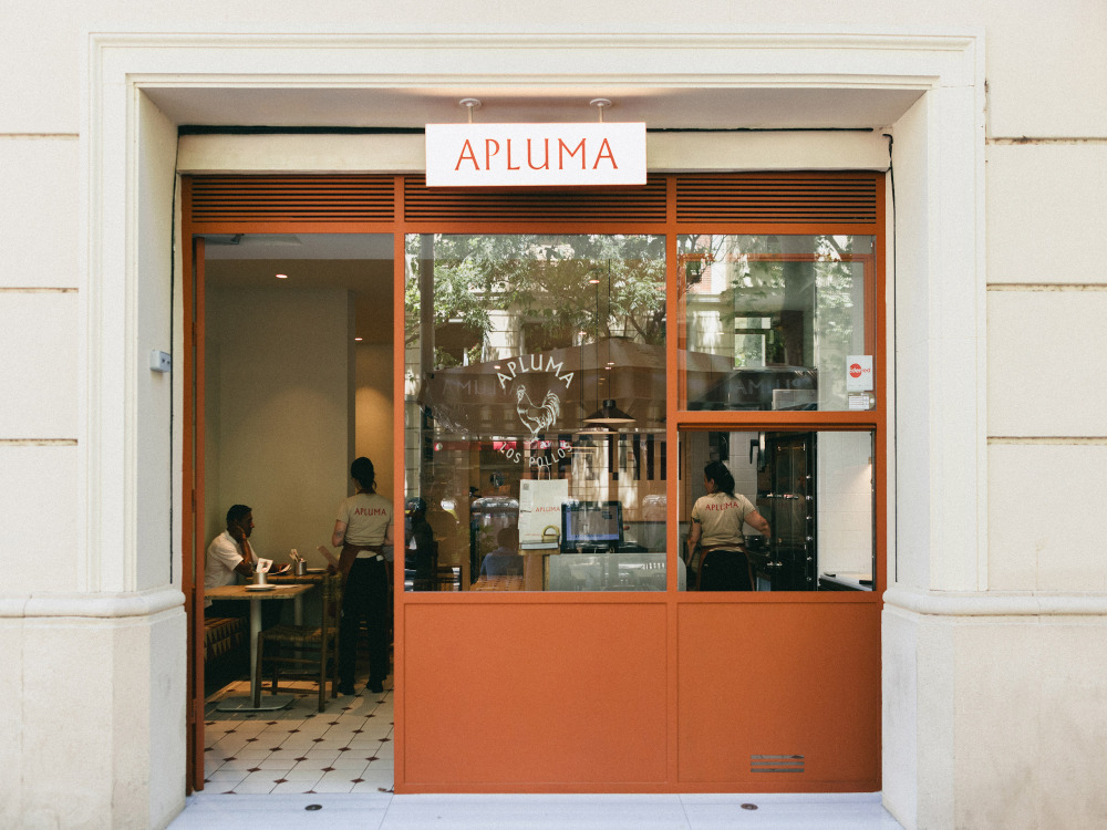
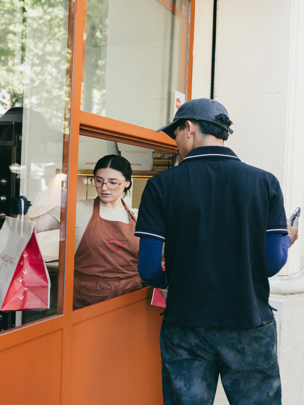
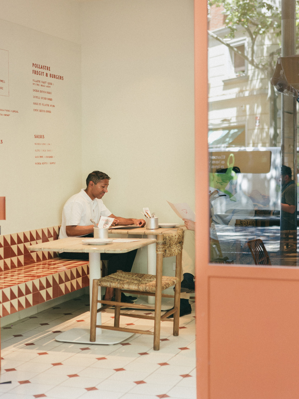
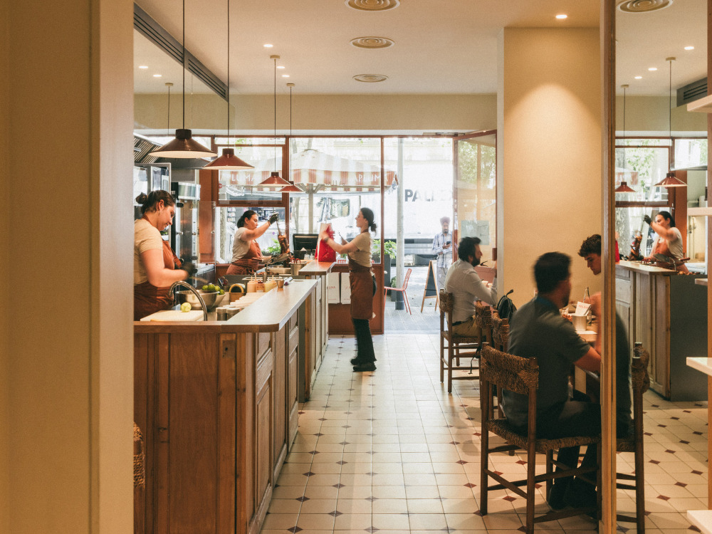
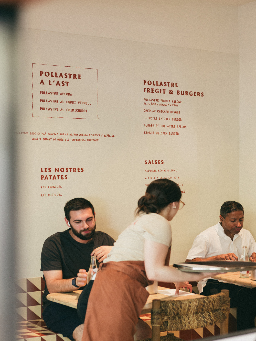
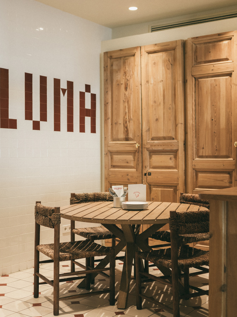
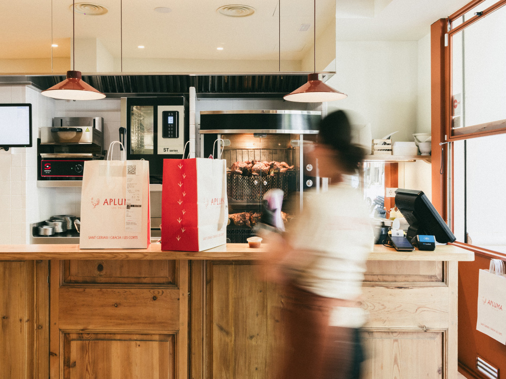
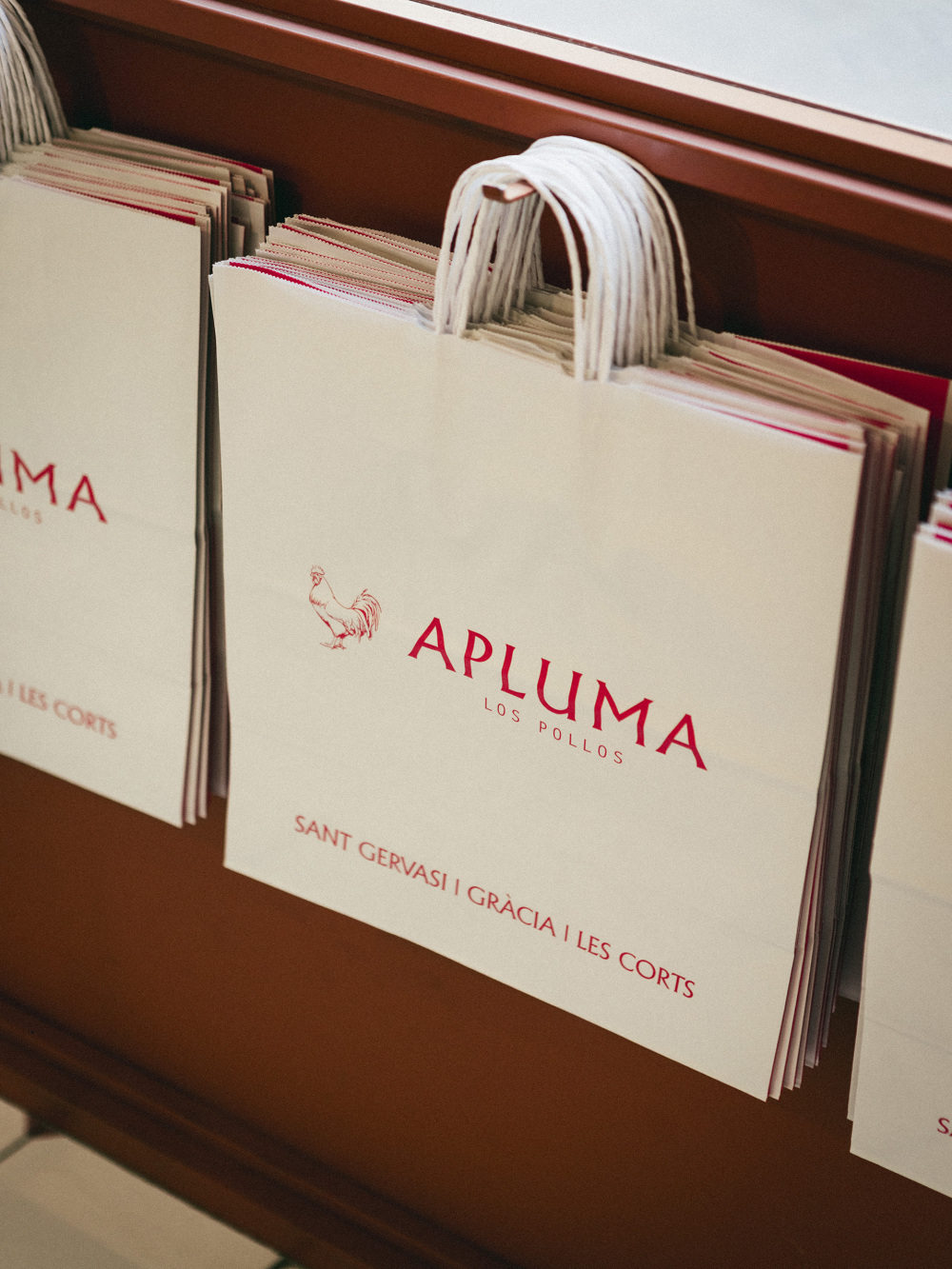
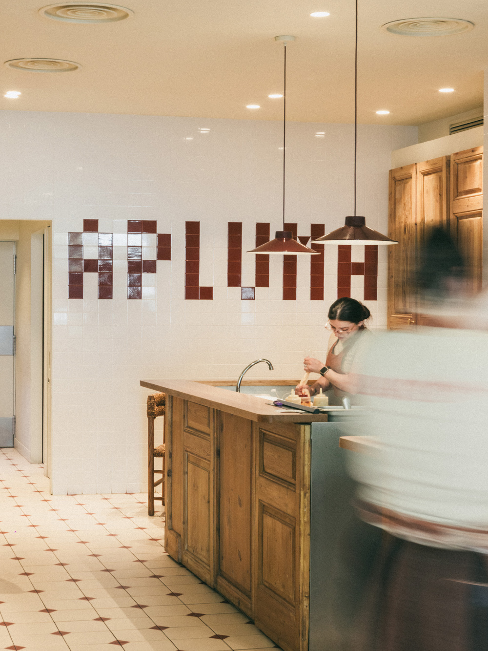
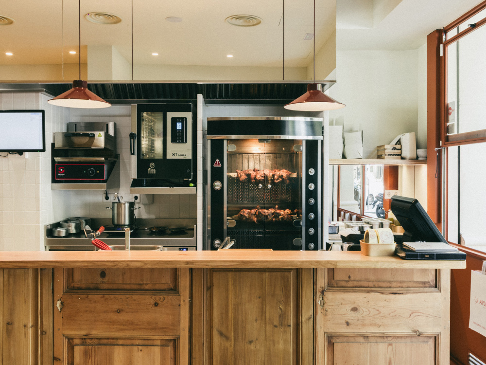
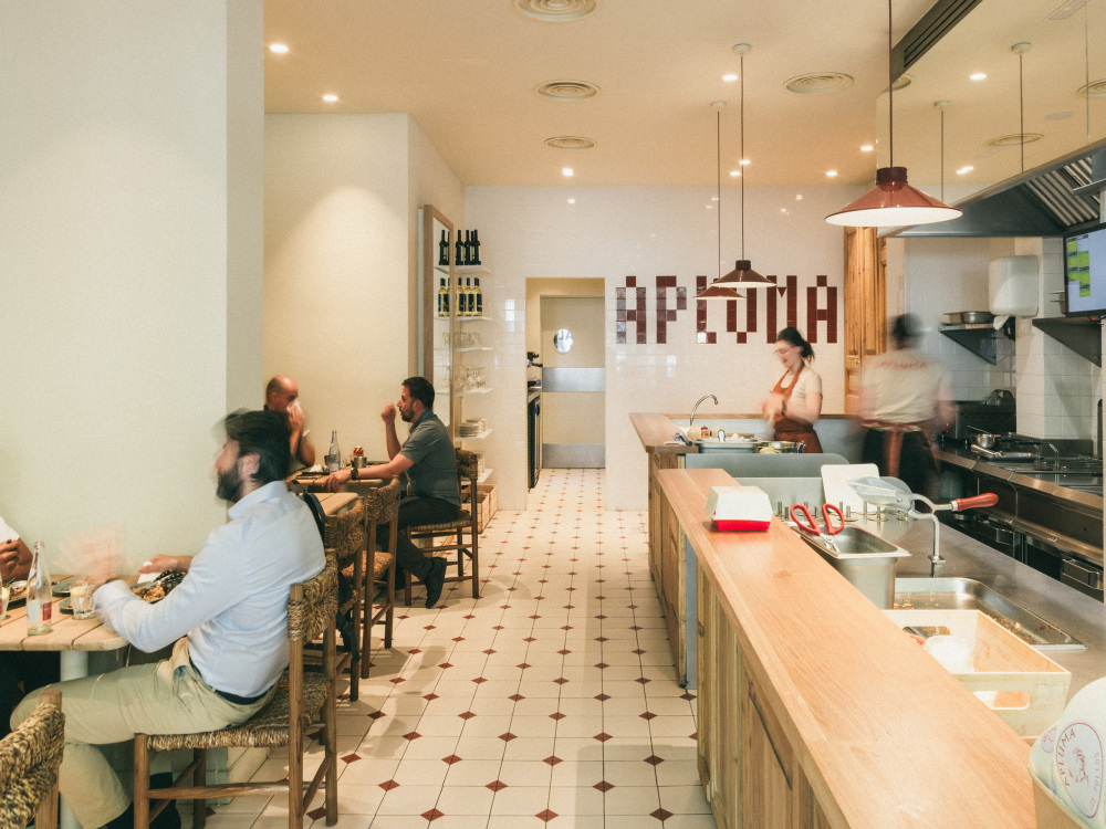
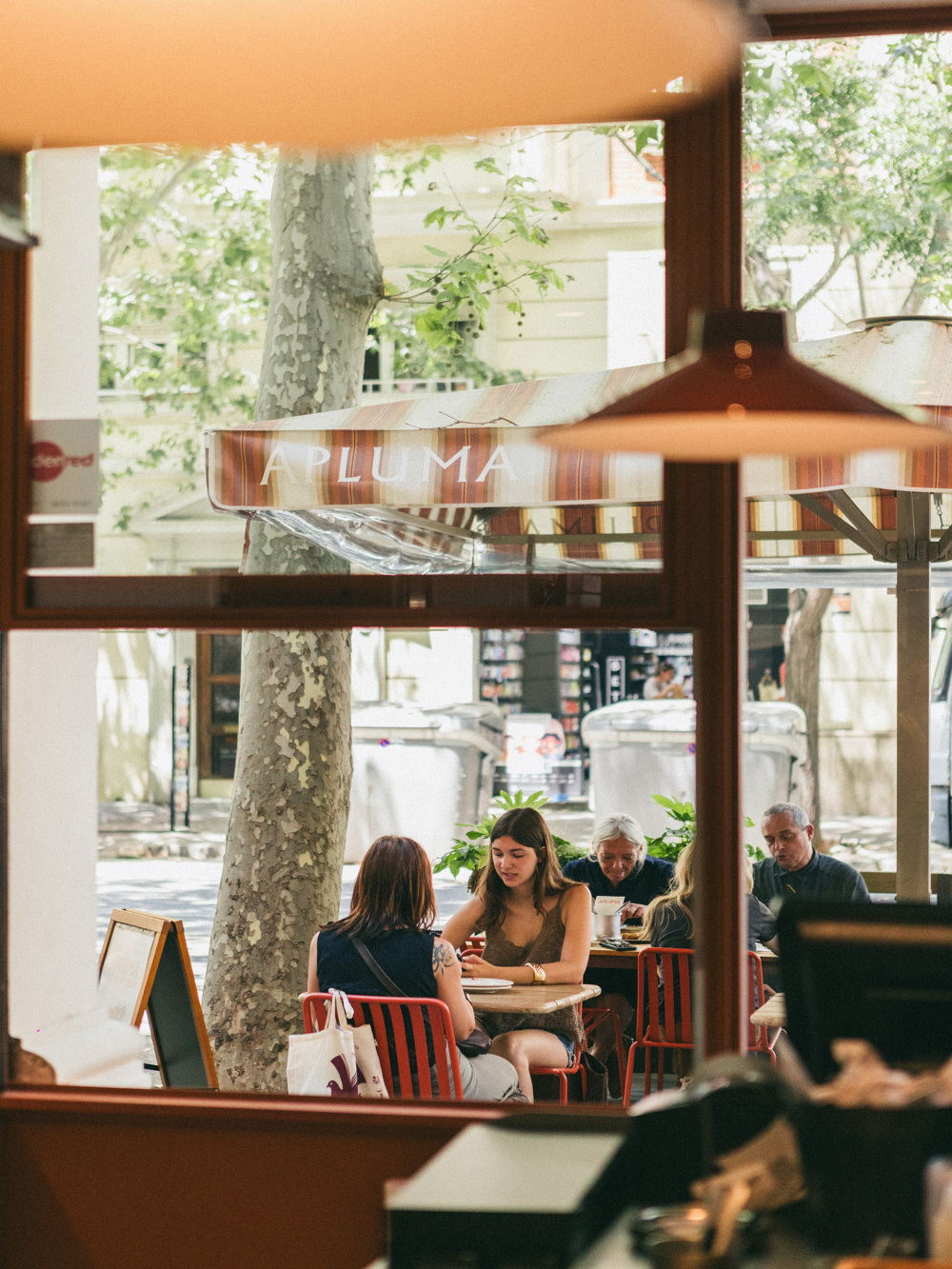
From the street, the kitchen takes centre stage, and above all, the chickens themselves. Counter units made from reclaimed wooden doors divide the two areas, bringing warmth and an authentic character to the space, while also serving as a pass for the waiters. At the back, a wall clad in white tiles incorporates a mosaic spelling out the name APLUMA, integrating the graphic identity into the space in a more distinctive way.The use of mirrors in certain elements, such as the extractor hood, helps to visually enlarge the space and reduce the feeling of narrowness, bringing more light and a greater sense of openness to the restaurant.In terms of graphic design, the brief was to update the logo, visual identity and packaging. The previous identity had become outdated and no longer reflected Apluma’s new positioning. At the owner’s request, the proposal retained the original corporate colour and typeface, while redefining the logo through a more restrained and contemporary language, aligned with the new identity of the brand.