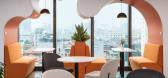
1 / iKame 办公室 | DPLUS VIETNAM | 2023 | 越南
1年前|OfficeSnapshots|办公|100%...eceiving morning sunlight and blocking the harsh afternoon sun.,Detail,Color is an important factor in creating an impression for this space. Combination of solid color, contrast, and 60-30-10 color scheme.,White and gray are the main colors of the project, accounting for 60%, exploited mainly...


预览图片
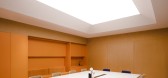
2 / 鞍山鞍钢Naibang化学品办公室设计
3年前|OfficeSnapshots|办公|100%...ing Province. The project has a footprint of 2004m².,Paint is a flowing color. The designer uses the conveyor belt on the production line as a source of inspiration, extracting and simplifying the pipelines and equipment, presenting as a device in a modern office environment, “injecting” colo...



预览图片
3 / 莫斯科埃尔卡法姆办事处设计
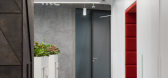
6年前|OfficeSnapshots|办公|100%...all other interior components, we use a triangular decor elements and logo color.The main solution of working areas is executed in light tones. The additional tactility of the interior is reached by light-colored textured concrete. Configuration of the recreation zones are created to bring contrast ...




预览图片
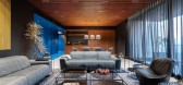
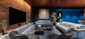
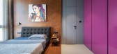
4 / (蓝色勺Haus豪宅)DIG Architects设计
6年前|Archilovers|住宅|100%...nce for the end user.
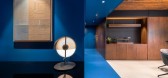
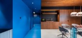
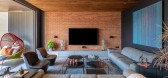
The spine of the design is the exuberant use of colors, which is a key element of the Indian culture. The subtle yet definitive use of colors to connect with the space without being overwhelming and out of sync presented a new challenge. The mainstay of the theory is the l...
预览图片
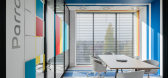
5 / 华沙阿克苏诺贝尔办事处设计
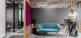
6年前|OfficeSnapshots|办公|100%...too. The space is vibrant with life, and the conscious use of products and colors gives the interior a unique atmosphere.
The project is split between two floors and we focused a lot of attention on the function so as to match the space to the needs of AkzoNobel’s young and dynamic team. The in...




预览图片
6 / Kirstie van Noort作品,陶艺精选作品
11年前|eminamcd|产品应用|100%...he samples formed the base material for a ceramic paintthat can be used to color porcelain. This Spring I visited Cornwall for the second time. I collected 50 new samples of different industries such as silver, lead, tin and copper. Thesephotographs showing the intense colors of the different places...
预览图片
7 / 该项目将说服你颜色组合你的整个家庭
6年前|ArchitecturalDi|软装|100%...n, look no further.
Jérôme Galland
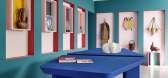
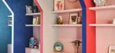
“I wanted to work with audacious colorways to create a fun, eye-catching space that highlights the design objects—curated this year by Graziella Semerciyan gallery—and also pay homage to the cubist nature of the building originally designed in the 1920s ...



预览图片
8 / Selen Kozmetik 办公室 | Udesign Architecture | 2024 | 土耳其
1年前|OfficeSnapshots|办公|100%...URBAN Care, which it began producing in 2013.,In the design process, the colorful corporate identity of URBAN Care and its emphasis on natural elements became one of the defining factors. Bright colors, which are part of the corporate color palette, were used throughout the office, supported by so...


预览图片
9 / 好咖啡,青岛 | 锐梵设计
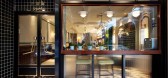
6年前|锐梵设计|餐饮|100%...esign is therelationship between space and brand. We hope to combine retro color matchingwith modern design methods to form a new and old dialogue and integrate thisconcept into the design.
外立面,墨绿色窑变砖内外统一,点缀铜色拉丝金属提升质感。Exterior facade, dark ...



预览图片
10 / Troquer办公室 | ASHO MX | 2021 | 墨西哥
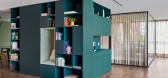
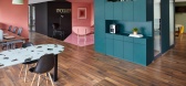
4年前|OfficeSnapshots|办公|100%...co City, Mexico, ,行业: Fashion / Beauty, ,ASHO MX utilized bright color backdrops and functional yet playful furniture for the Troquer offices in Mexico City, Mexico.,This project is made up of 313m2, distributed in various areas: Reception, meeting room, administration and finance area, ...




预览图片
11 / 安阿伯毛涤纶办公室设计
5年前|OfficeSnapshots|办公|100%...e space for various gathering types.
Each meeting room is an immersive color experience inspired by the Swedish origins of the company and their vibrant use of color as a cultural practice to brighten the long winter nights. This overapplication of color camouflages the exposed mechanicals and c...


预览图片
12 / 日本蓝瓶咖啡京都清山口咖啡馆(2020)(Jo Nagasaka+Schemata Architects)设计
5年前|archdaily|餐饮|100%...yoto opened in a space near the front entrance to the hotel.,In terms of color, the renovated building is basically composed of white walls in common areas and black window frames. Considering Blue Bottle Coffee's tendency to use few colors, the basic color palette would be black and white but we ...


预览图片
13 / TR6房子(2020)(Raz Melamed architects)设计
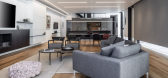
5年前|Raz.Melamed|住宅|100%... privacy for residents and visitors. Through the gate entrance, a game of colorful architecture is played out between the blocks of the building, with a gray foreground and white background. The division of masses is decorative as well as functional, including a seam-like staircase used to bring i...




预览图片
14 / 特拉维夫Colu办公室设计
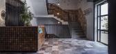
5年前|OfficeSnapshots|办公|100%...ght create a design that is warm, and then integrates natural textures and colors throughout the office.
The initial reception area sets the overall tone for the design of the office space and features a mosaic tile with varying shades of brown tones. Each tile is stamped with a different pattern...




预览图片
15 / 以色列贵族能源办公室设计
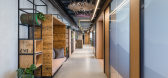
6年前|OfficeSnapshots|办公|100%...ion for the design was the gas platform: its geometry, its materiality and color scheme, and the feeling one has standing on it. In effect, the concept was created for the exposed ceilings of the project.All the ceilings were painted in a deep blue, simulating the sea, under them are galvanized pipe...




预览图片
16 / 土耳其安纳托里亚机构办公室设计
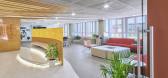
3年前|OfficeSnapshots|办公|100%...ishing, ,BAB Architects designed the Anadolu Agency offices with pops of color highlighting a welcoming space in Ankara, Turkey.,Anadolu Agency Ankara Open Office Project redesigned with an open-plan, functional and innovative approach by BAB Architects, which is developed in order to create a d...




预览图片
17 / 芝加哥Kuchar办公室设计
3年前|OfficeSnapshots|办公|100%... ,Kuchar crated a space for their team to work and collaborate with bold colors and design in Chicago, Illinois.,The Kuchar office was designed to represent the creative and curious design culture of the studio. Inspired by trends in fashion and interiors, the color palette is a mix of bold yet ...




预览图片
18 / 灵帝办事处(LINGDI Office)WJ Design 设计
6年前|WJ.Design|办公|100%...how to express the excellent fabric material and cutting through space and color. Leo Hu, the designer, hopes to use simple lines and devices to reshape the space and create a space integrating exhibition, reception and office.,The simple color block and the space are separated by the use of desig...


预览图片
19 / 香港联合微电子中心办事处设计
6年前|OfficeSnapshots|办公|100%...ain a simple yet welcoming environment in the office, warm and contrasting color material such as wood flooring and contrasting color fabrics & carpets were used through out the office area and furniture. To balance out the use of wood with natural and warm tone in entrances and townhall, contrastin...


预览图片
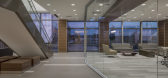
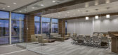
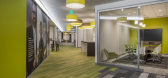
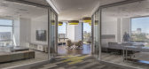
20 / 圣地亚哥Illumina办事处设计
6年前|OfficeSnapshots|办公|100%...cluding 1:1, privacy room, lounge, “kitchen” table and media scape.The color palette is intended to be light and warm with opportunities for color pop at key design features. Color is an important aspect of the Illumina identity. Pumpkin orange is their primary corporate color with supporting co...
预览图片
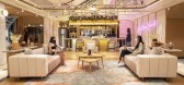
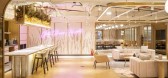
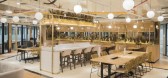
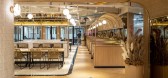
21 / 雅加达GoWork共同办公的办公室设计
5年前|OfficeSnapshots|办公|100%... cozy lounge where you can relax and forget a bit about your problems. The color scheme for this temporary office also emphasizes the comfort and the theme.
The designer uses a neutral palette as the main color theme. This color blends very well with the mall, but when you enter this space, you c...


预览图片
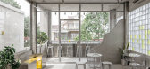
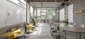
22 / 越南 YAMA 咖啡馆 | 2021 | KSOUL Studio
5年前|archdaily|餐饮|100%...hat Tay Ninh is in its modernization, Ksoul decides to use the cement gray coloration which represents the urbanization concept, and yellow which is the brand color and also the reminder for the sun that has shined on this land. It is also safe to say that this location could be the beginning of the...



预览图片
23 / 我们从这家时髦的新酒店偷走了意想不到的颜色组合。
6年前|ArchitecturalDi|软装|100%...f Newport’s rocky coastline and the warmth of the town itself. From bold color schemes that mimic the horizon line to muted tones that represent the moodiness of the New England coastline, every choice was designed to make you feel fully immersed in the surrounding landscape. To learn the secrets ...


预览图片
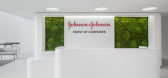
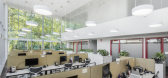
24 / 莫斯科强生事务所设计
6年前|OfficeSnapshots|办公|100%...panels with individual design have been installed on every floor.The light colors of the office are complemented by bright accents of red and blue – corporate colors of Johnson & Johnson. Mint color is highlighted in the dining areas, as well as shades of light wood. Green color is located both in...




预览图片
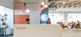
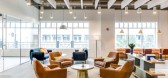
25 / Gather 办公室 | Campfire & Co. | 2020 | 美国
3年前|OfficeSnapshots|办公|100%...d unique context of the area’s neighborhoods. Natural materials, vibrant colors, and warm textures combine with signature collaboration zones, inspired meeting rooms, and abundant natural light to create a workspace that feels branded to Virginia Beach while rooted in Gather’s core values.,Opp...


预览图片